


Amy Gilligan and Dominic Jones crunch the numbers to understand what happened in November’s election in the United States
To the surprise of most observers, Donald Trump won the 2016 presidential election in the United States. It is clear that an important task at the present time is to oppose his policies and the political climate they have helped to build. Trump has already signed orders that are, among other things, racist, sexist, and Islamophobic, bringing millions of people around the world to the streets to oppose him. But as well as tackling the consequences of Donald Trump being president of the US, it is important to understand the reasons why there was a Republican victory in the November elections: what does this tell us about the underlying political and social climate in the US?
Particularly from outside of the US, it seems odd that although Clinton gained 2.5 million more votes than Trump nationally, it is Trump that sits in the White House. The reason for this is, in short, that the Democrats lost in Florida, Ohio, Pennsylvania, Iowa, Michigan and Wisconsin. In all states apart from Maine and Nebraska a presidential candidate simply needs to be the person with the most votes in that state to win all the electoral college votes, so a win of 51% is worth just as much as a win of 85%. Because the Democrats lost the Electoral College votes of the six states mentioned above, Trump was able to far exceed the 270 Electoral College votes needed to win the presidency.
All six of the states that changed from Democrat to Republican in 2016 were viewed, rightly, as battleground state prior to the election. With the exception of Florida, they had predominantly voted Democrat in the previous six presidential elections, albeit sometimes with very slim margins.
We focus here on trying to understand what changed from 2012 to 2016 by comparing electoral and demographic data on a county-by-county basis within these states, and then compare these results to similar analysis across the US. Looking at the data on this level of granularity means we can hopefully better tease out some of the details that get smoothed out when looking at the state as a whole. In particular we are interested in what demographic factors correlate with the relative change in vote for the Democrats and Republicans, respectively, from 2012 to 2016.
It is reasonable to say that Clinton lost the election just as much, if not more, than Trump won it: the Democrat vote went down in 2689 of the 3107 counties examined across the US, and many cases the Democrat loss was numerically larger than the Republican gain. Thus understanding the change in Democrat vote is as important as understanding the change in Republican vote to gain a clear picture of the election results.
To come up with explanations as to what is happening in the world, we need to augment our own experiences with data gathered by others. This can mean reading journalists’ reports of events, but it can also mean looking at demographic information. While demographic information is only a part of the story, the far left is currently too weak across the world to be able to answer the question through daily conversations with others. Looking at demographic and polling information rather than exit polls has the advantage of covering a much larger section of the population so hopefully having more accurate results.
We investigate thirteen demographic variables:
- Percentage of population below the poverty line
- Percentage of the population over 25 with a bachelors degree
- Percentage of the population over 25 who graduated high school
- Percentage of the population who are homeowners
- Percentage of the population aged over 65
- Percentage population change between 2010 and 2014
- Median household income
- Percentage foreign born population
- Percentage white (non-Hispanic) population
- Percentage black population
- Percentage Hispanic/latino population
- Percentage Native American/Native Alaskan population
- Percentage Asian population
We express the measure of correlation in terms of the correlation coefficient, r. An r value of 0 indicates no correlation (i.e. the two things have no relation), 1 indicates a perfect positive correlation and -1 a perfect negative correlation.
Change in Democrat vote

In the six states that changed from Democrat to Republican in 2016, the strongest and most consistent correlation with the change in Democrat vote from 2012 to 2016 as a proportion of the 2012 vote is found to be the proportion of the population who have bachelor degrees. Looking at the data for each state on a county-by-county basis, the correlation coefficient, r, ranges from 0.76-0.94 and, as can be seen in the figure above, there is a strong positive correlation in each state, although the model describing the data does change slightly on a state-by-state basis. This is an important demographic factor in most other states too: our results show a strong (r>0.7) positive correlation in 32 of the states investigated, and a moderate (r=0.5-0.7) positive correlation in a further 9 states: the lower the proportion of people in an area with a degree, the larger the decrease in the Democrat vote as a proportion of the 2012 Democrat vote.
There are strong to moderate positive correlations with the population change in the six changed states, ranging from 0.65 to 0.76. Although some of the change in vote may be due to actual changes in the population, the change in Democrat vote is in many cases an order of magnitude or more larger than the population change. The correlation of change in Democrat vote with population change is an important factor in other states too: of the 48 states investigated 18 show strong correlations and a further 14 show moderate correlations.
Other factors showing strong to moderate correlations with the change in Democrat vote in most of the states that changed from Democrat to Republican in 2016 are percentage Asian population (r=0.60 to 0.88), median household income (r=0.59 to 0.73), percentage foreign born population (r=0.42 to 0.87). These are all factors that show strong to moderate correlations in many of the other states investigated, although non are as a consistently strong correlation as the proportion of people with bachelors degrees. With the exception of Florida, percentage population over 65 (r=-0.46 to -0.74, Florida 0.08) also shows a strong to moderate negative correlation, although many other states only show a weak correlation.
Poverty shows a weak negative correlation to no correlation with the change in Democrat vote, and across all states there is a wide range in r values: it does not show a consistent pattern. A similar pattern is observed with respect to homeownership there is a weak negative correlation in the changed states, but no consistent pattern across the board. With the exception of the Asian population other racial demographics show only weak correlations. There is a generally negative correlation with respect to the white population, generally positive with respect to Black and Hispanic/Latino populations and no consistent correlation with respect to the Native American/Native Alaskan population.
Change in Republican vote

Looking at the change in Republican votes from 2012 to 2016 it is not surprising to see some of the trends from the change in the Democrat votes mirrored, although the correlations are generally weaker and less consistent between states. The proportion of people with Bachelors degrees remains the strongest correlation for all of the changed states, apart from Florida, with r values of -0.68 to -0.87 (Florida r=-0.28): the lower the proportion of people with bachelors degrees in a state, the more the Republican vote went up by. Looking at the data set as a whole, the strong correlation with change in Republican vote and percentage bachelor’s degrees holds generally true for states where the Democrats won in 2016 and 2012, but the correlation is weaker in states that voted Republican in 2016 and 2012.
A difference in the correlation coefficients between Democrat and Republican voting states can also be seen in the correlations with population change, median household income and Asian population, with all of these showing moderate correlations in Democrat voting states, but much weaker correlation, and sometimes of the opposite trend, in Republican voting states. Such differences are not really seen in the correlation coefficients for the change in Democrat vote.
Combining factors to produce a better model
In order to fully understand what happened it is useful to look at combinations of factors. To do this we produced the best linear model looking at all the counties in changed states. This was done for both change in Democrat vote and change in Republican vote, the models being different in each case.
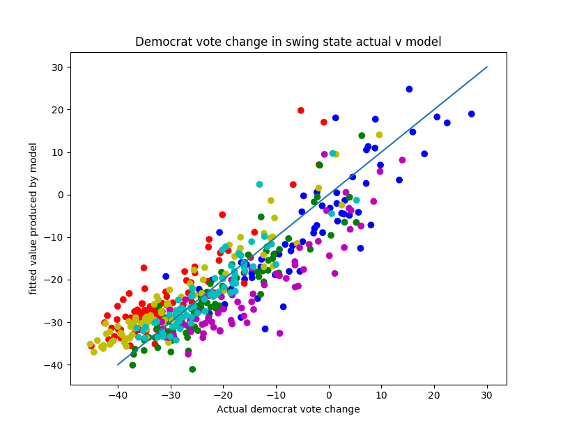
Looking at change in Democrat vote, a model of four factors was found. These were percentage bachelor’s degree, percentage Hispanic/Latino population, percentage black population, and change in population. Combining these four factors gave a model that was an improvement on using the percentage of people with bachelor’s only. The results of the model are shown on the graph below. (Fl = blue, IA = red, MI = green, OH = yellow, PA = magenta, WI = cyan). It is worth noting that there is a positive correlation with all of the parts of the model (i.e. the Democrats did better when there were more people with degrees or a higher proportion of black or latino people or where the population is increasing). The model fits the data quite well and better than fitting individual demographic factors on their own.
Having produced the model based on data from the six states that changed hands in 2016 it is interesting to see which other states fit this pattern. The model was tested individually on all 48 states in our study and they were ranked according to how well they fit the model. The model can account for over 70% of the variance in 24 of the 48 states, indicating the trends found in the swing states were replicated across many parts of US, but not everywhere. The following table shows the states listed in order of how well they fit the pattern. States highlighted in orange are taken from Wikipedia list of swing states. In yellow are the six states that switched from Democrat to Republican in last election. The list of states the model best fits are mostly Democrat voting states or states the Republicans have recently taken from the Democrats.

When carrying out the same analysis on the Republican vote the results were not as clear. The change in Republican vote could not be modelled as well using the demographic information. A model containing six factors was produced: percentage of people with bachelor’s degrees, percentage black population, percentage over 65, percentage below the poverty line, percentage of people who graduated high school and percentage population change. For the change in Republican vote, the proportion of people with degrees and black population both had a negative effect, the rest were positive. The model was only able to describe just over half the variation present in the data and adding in other demographic factors was unable to improve the model further. The graph shows the model is reasonably accurate, but it fails to explain the counties with the largest increases in Republican vote, tending to underestimate the change in vote there.

The same model was then used to try and explain the Republican vote change in the other states. As is to be expected, it is a worse model than that for the change in Democrat vote and only explains the vote change well in a small number of states.

The high values for Delaware and Rhode Island are not reliable as neither contain enough counties for accurate analysis by this method. Wisconsin and Michigan are the only two of the states that swung to Trump that the model fits well. It is again worth noting the model appears to fit Democrat voting states better than Republican ones.
Discussion
While there are some limitations of using demographic data to try to analyse election results in this way, it is an analysis based on facts rather than trying to fit the world to how we want it to be. Having a clear picture of how the world actually is, rather than how we would like it to be is an important step in deciding how we take the movement forward.
Looking at change in Democrat vote, our results show that the strongest correlation is with the proportion of the population with degrees. We do not think this is because of ‘education’ in a narrow sense. Furthermore, the analysis we present here doesn’t necessarily tell us how people with or without degrees (or indeed any of the other demographic factors) behaved in the election. Rather, what the results do demonstrate is that areas with higher proportion of people with degrees, and areas that don’t, behaved differently when it came to giving Clinton support compared to how they had voted with respect to Obama. Explanations are more likely to lie understanding what the effects are of there being more or fewer people with degrees in these areas and why this difference has arisen.
People who have degrees are largely more mobile than people who do not, and are more likely to move. Specifically, they are more likely to move to areas with more jobs, in a similar way to how many migrants behave. Thus areas with more jobs are likely to be the ones with the highest proportion of people with bachelor’s degrees.
While there has been some limited and partial recovery from the 2007-08 crash in the US, this has been quite uneven, with some areas that were badly hit seeing little improvement or things getting worse. A study by Georgetown University in 2016 showed that of the 11.6 million new jobs created since the recession, only 80,000 went to those without some post-high school education after this group lost 5.6 million jobs between December 2007 and January 2010. In contrast, 8.4 million new jobs went to those with bachelors degrees or higher. Further, they find that 57% of all wages in the US go to bachelor’s degree holders, despite, at present, those with degrees making up 36% of the workforce.
People may have, rightly, felt abandoned by the Democrats over the last eight years, and so abandoned the party when it came to the polls.
The Republican vote change is less well described by the demographic factors examined here. This possibly indicates there are significant political variations between different counties which determine to at least some extent people’s enthusiasm for voting Trump versus just staying at home.
Finally notable that on a state level that it is possible to draw quite clear divides between Republican and Democrat voting states based on some of the demographic categories (although not all). Once again the proportion of people with degrees is marks out an important dividing line.

Only two Republican voting states, including the ones which changed to Republican in 2016, have a proportion of people with degrees over national average of 28.3%. These are Utah, which is unusual in having a high Mormon population, and Kansas. Further, only three Democrat voting states had proportions of people with degrees below national average: New Mexico and Nevada, both of which have high Latino populations, and Maine, which actually saw one of its five electoral college votes go to the Republicans rather than the Democrats.
This possibly shows that the proportion of people with a degree is a signifier of longer term divides between Republican and Democrat states. This may indicate that the result of this election and how people voted was a continuation of ongoing national trends rather than a break with them.
Conclusion
We have carried out an analysis of the election result using demographic data. This has shown that areas with a lower proportion of people with degrees saw the biggest drop in Democrat vote. This trend holds across Democrat and swing states but to a lesser degree in Republican states. This model can be improved by taking account of racial make up of the areas and also changes in population. The changes in Republican vote can not be modelled as well using demographic data, although a similar but weaker trend is observed. While demographic analysis alone does not provide us with answers to the important political questions of what do we do now, our explanation of the election result needs to be consistent with reality and demographic information can help us understand what that reality is.


This is an interesting study and discussion. Unfortunately, though, I have to agree with Jan; the writing is so difficult that I can’t share this with many people. Sometimes I found myself having to read a sentence more than once to make sure I haven’t confused the positive with the negative correlation. It may be that I’m tired, but one shouldn’t be required to have the same clarity of mind to read an article on this website as that required to read a scientific paper. Some redundancy can be good in this context.
Also, it would be a good idea to intersperse the statistical findings with some of the possible explanations and discussion thereof, instead of having the conclusion in a separate section.
An interesting study, but I really only understood part of it (and I have a PhD though not in demographics or statistics) and am guessing on the rest. I’m not really good at reading charts. Perhaps many others are as well. Perhaps many others are as lazy as I am to figure out all this information. I have lots of other things I would prefer to be doing.
I could have used a useful summary at the end. That is, it should have said something like: These changes in demographics (education, race, age, poverty, etc) individually show that…and then discuss how each one contributed to a decrease in Democratic voters in what number of states and which key states.
In statements like the following from your text I have inserted a needed word for clarification. This should be repeated with each finding. “In the six states that changed from Democrat to Republican in 2016, the strongest and most consistent correlation with the [*negative*] change in Democrat vote from 2012 to 2016 as a proportion of the 2012 vote is found to be the proportion of the population who have bachelor degrees.” The sentence is also overly wordy/long.
I would like to pass this information on, but I know most of my contacts would also appreciate a better summary at the end. Also, a good summary would help for posting on FB since most people only read the blurbs posted and not the whole article.
I am writing this because I assume you would like to reach as many people as possible with your message. Jan Briggs